5 Tips to Designing a Modern Album
As a company, we’ve seen hundreds of different albums come through our doors over the years. We’ve seen multiple stylistic preferences from clean, modern, minimalistic albums to traditional albums with text and opaque background images. Each album design style can serve a specific purpose depending on your client and photography style. However, as a company, we’ve always been drawn to the story and style of a modern album. Here are 5 tips for designing a beautiful modern wedding album for your client!

1. TELL A STORY
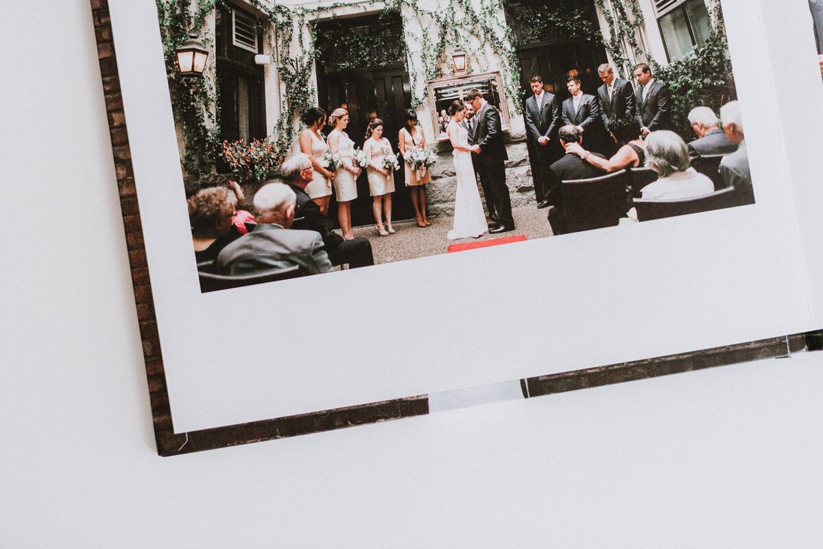
An album is a bride and groom’s tangible happily ever after, so it needs to tell that day’s story. These days, modern wedding albums don’t need words or captions to describe every event. The images you take evoke emotion. And, when laid out properly, the album becomes a storyboard for the most exciting day of a couple’s life. The best way to do this is to chronologically layout the album you’re designing, keeping sequences on the same spread or page.
TIP: Try using 1 spread per moment or theme. (example: Bride getting ready)
2. NEGATIVE SPACE
Negative space, or white space, is key when you’re designing a modern wedding album. Gone are the days where every square inch needed to be filled with images. In fact, blank or negative space done well will help focus your viewer's eyes to images on the spread and help move the reader along.
TIP: Don’t be afraid to go far within your allotted bleed lines.
3. LESS IS MORE
You might send your client 600-900 fully edited images from their wedding day. But, that doesn’t mean that you need all those images in your album. Filling an album spread with an image of the bride and every bridesmaid smiling or making “silly” faces is unnecessary and will make your album look cluttered! Choose the best images, that tell the best story. A typical wedding album can have anywhere between 15-30 spreads.
TIP: An easy formula to follow when choosing images for an album is to select 3-4 images per spread.
4. CROSS INTO THE GUTTER
The gutter is your friend! Stop looking at an album as a left page and a right page. Instead, treat the 2 pages as 1 spread or page. You’re spending a lot of money to have a quality wedding album for your client that lays flat, so take advantage of it. Push images to the edges and spread across the centrefold. Just keeps the center fold from being directly on top of someone’s face.
TIP: If designing in InDesign, be sure you find out the specs from your printing company before you start designing your album!
5. SHAKE UP THE SYMMETRY
Asymmetrical spreads add an element of depth and intrigue to a wedding album more than a symmetrical layout can. Our eyes can easily process symmetrical design, but need to spend an extra moment to absorb the arrangement of an asymmetrical layout. Use an asymmetrical spread to showcase two similar images shot at different angles.
TIP: Try creating a layout that’s signature to your style.

Designing a wedding album can be so easy, when implementing these 5 easy tips. Make your images pop and your clients so happy!